


The Tool for Fortune 500 Distributors
Apple, Honeywell, United Airlines, Greybar. What do they have in common? eTurns
My Role
Project Co-Manager
Designer
Team
2 Co-Managers
4 Designers
Timeline
6 Months
January - July 2026
Industry
Inventory Management
Tools
Figma
Claude
Vibe Coding
Skills
Project Management
UX Research
User Testing
Vibe Coding -> Handoff
01
Overview
In Short
I co-led a six-person team through a six-month redesign of eTurns’ flagship mobile app, from teardown to developer handoff.
eTurns builds vendor-managed inventory software that automates replenishment at the point of use, serving customers like Honeywell, Graybar, Border States, United Airlines, and Medline. Their mobile app, TrackStock, is what technicians, warehouse clerks, and distributor reps open every day to pull parts, place orders, and keep stock where it needs to be — across twelve distinct workflows.
I joined eTurns as a Design Intern and was asked to lead the app’s first full redesign, working with four other designers from initial teardown all the way through developer handoff.
03
Research and Discovery
The Process

Copy on the steps we took throughout
01 - Company and Product Brief
02 - User Testing & User Surveys
03 - Design teardown
01
TESTINg
Testing the App As It Existed
We didn't lead them along. We watched them try, and let the awkward pauses do the talking.
With those personas in hand, we ran moderated usability sessions on the eiisting app. - not a prototype - to see exactly where their workflows broke down, then backed it up with a survey of real users.
17
users surveyed
12
users interviewed
__
hours of training for new users
RANKED BY EVIDENCE
Pain Points
Six problems, ordered by how much of the data pointed at each one.
01
PAIN POINTS
Ranked by Evidence
Six problems, ordered by how much of the data pointed at each one.
PAIN POINTS
Ranked by Evidence
Six problems, ordered by how much of the data pointed at each one.
03
Research and Discovery
Watching Real Users Get Stuck
We didn’t ask people what they thought of TrackStock. We observed and surveyed them in thier daily use, and let the awkward pauses do the talking.
Testing the App As It Existed
With those personas in hand, we ran moderated usability sessions on the existing app — not a prototype — to see exactly where their workflows broke down. We didn’t lead them along, but rather sat back and observed thier successes and pain points. We watched them try to use it, and let the awkward pauses do the talking.
The results were rough. Pulls scored a 4 out of 10 for ease. Transfers scored a 1 out of 10, with a confidence score of 2 out of 10.
The eTurns Trackstock app requires _____ hours of training to use.
We surveyed 17 Users, and Interviewed 12. The results were as follows:
Warning signs:
11 of 14 say they occasionally have difficulties using the app.
8 of 14 say they sometimes or frequently tap the wrong element because of spacing.
Pain points, ranked by evidence
1. Sync and "Reset Data & Settings." Syncing speed is the lowest-rated feature: 3.07, with only 36% satisfied and 3 negative ratings. About 7 of the 12 users who left comments raised this on their own:
The fix people asked for most was auto-updating as part of the normal sync.
2. Receiving. This is the second-lowest feature at 3.25/5, with 42% satisfied. Part of the problem traces back to #1: if a user forgets to reset, they don't see the latest orders. People also described receiving as slow on site even with good signal. One user wants a simpler path for non-consigned replenishment.
3. Permissions - No way to hide tiles by permission. Four respondents want admins to be able to lock or hide home-screen tiles. For example, a user who should only do pulls still sees Orders and Cart, which confuses end users and leads to mistakes.
4. Login and shared devices - Users described the login flow as convoluted when several workers share one device and you need to track who took material. Other complaints:
5. Touch targets and density. Tool lists are small and hard to use with gloves. Users want:
Bigger tables, with the most important info shown up front.
Landscape mode to see more columns.
This matches the 57% who mis-tap at least sometimes.
6. Error recovery. This is the weakest UX statement in the survey. Only 57% agree the app helps them recover from mistakes.
02
CURRENT STATE TEARDOWN
Down to the Roots
copy here
Based off of these findings, we began to analyze Trackstock for the root causes.
To the right, you will find some examples of pain points that were highlighted in our teardown to find the root cause of pain points found during user testing and surveying.
"An App Built for Inventory, Not the People Using It"
A key pain-point found within our user interviews: The Table View. In its current state, you can scroll both Horizontally and Vertically, creating a messy and overwhelming view of a multitude of data categories.
EX 1
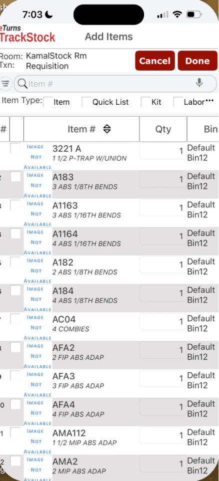
Item Images were disabled for some users, and not working for others. Despite this, the view, but still included in all views for all users on the screen.
Table Data Cells did not differentiate between editable and non-editable fields, confusing the user.
Native device UI elements were often forgotten. Visual and textual errors in spacing, readability, copy content, and overall design consistency.
Typos
Native Element Overlap
Outdated Branding Elements
Ex 3
05
Design Process
From Sticky Notes to a Workable Flow
Every module got the same question: what’s the fewest taps between “I need this” and “done”?
With a prioritized list of problems in hand, I ran the team through crazy 8s on the highest-friction flows before committing to a direction — sketching fast enough that overthinking wasn’t an option.
[ ADD: which specific problems you ran crazy 8s against, and which sketch direction the team converged on ]
What Changed
Pulls: now shows on-hand, min, and max inline on every card, lets people tap a quantity to type it directly instead of stepping through plus and minus, and adds a “scan again” option so no one has to back out to a menu between items.
Work Orders: adopted the same card language as Pulls and separated pulls from returns and credits — a distinction technicians had been confusing constantly.
The home screen: was rebuilt entirely around workflow tiles, with one prominent sync button, a “last synced” timestamp, and admin-configurable visibility so each person only sees what’s relevant to their role.
Testing It Again
As soon as clickable mid-fidelity prototypes existed, I put them back in front of users. The difference showed immediately: Orders jumped to a 10 out of 10 for ease — “intuitive,” “flows really easily” — and Transfers, which had scored a 1 out of 10 in round one, came back at 8 out of 10.
06
The Solution
Twelve Workflows, one Coherent app
A design isn’t finished when it’s approved. It’s finished when it’s built right.
[ ADD: a summary of the finished design — what changed most from the original app, and how it answers Elena, Herald, and Robert’s pain points specifically ]
Handing Off to Engineering
[ ADD: how you structured handoff — specs/redlines, dev sync cadence, and any tradeoffs made once real engineering constraints entered the picture ]
07
Results
What Changed
The numbers told the story better than I could
Transfers: went from a 1 out of 10 ease score (“very difficult and unintuitive,” 2/10 confidence) to an 8 out of 10 after redesign.
Orders: scored a 10 out of 10 for ease in the very first round of testing on the new flow — “intuitive,” “flows really easily.”
The sync flow: moved from a 4-step path buried in Settings to a single visible button on the home screen.
The settings icon: was found instantly with zero prompting after the redesign, with no discoverability issues reported.

Our lovely team, Apoorva my Co-Lead, Alysen, Me, Noah, Mira, Pavani Respectively.
04
Leadership
Leading Four Designers Through Six Months
My job stopped being just about the pixels the moment the project started — it became about keeping four other people solving the same problem at the same time.
The moment this project started, my job stopped being just about the pixels. Leading four other designers through six months of research, ideation, and testing meant making sure everyone was solving the same problem, at the same time, without duplicating work or losing the thread between research and design.
??? Fill in how actually lead.
08
Reflection
What Leading this Project Taught me
Six months, four teammates, and one very overwhelming project later — here’s what actually stuck.
FILL IN: WHAT LEADING THIS ACTUALLY TAUGHT YOU
What was hardest about leading this versus just designing it yourself?
What would you do differently if you started over?
What are you proudest of from this project?
How did you grow specifically as a leader — not just as a designer?
